KWARTAŁ 27
KWARTAŁ 27 residential estate identity: from the entrance to the keys
A residential estate brand shown on four applications: entrance signage, a courtyard plan board, an investment catalogue and a key box.
- Client
- KWARTAŁ 27
- Industry
- Real estate / residential estate
- Year
- 2026
- Scope
- Branding & Social Media
Challenge
KWARTAŁ 27 is a residential estate with brick architecture, a green courtyard and the line "Miasto w twoim rytmie" (the city at your pace). The brand had to accompany residents at every stage: from the first contact with the development, through choosing a flat, to the day the keys are handed over.
So the identity had to grow out of the estate's architecture rather than be laid on top of it, and work both in space (on walls, boards and around the grounds) and in the sales materials buyers look through at home.
Solution
We took the palette and forms straight from the buildings:
- brick browns, warm light surfaces and metal details echo the materials the estate is built from,
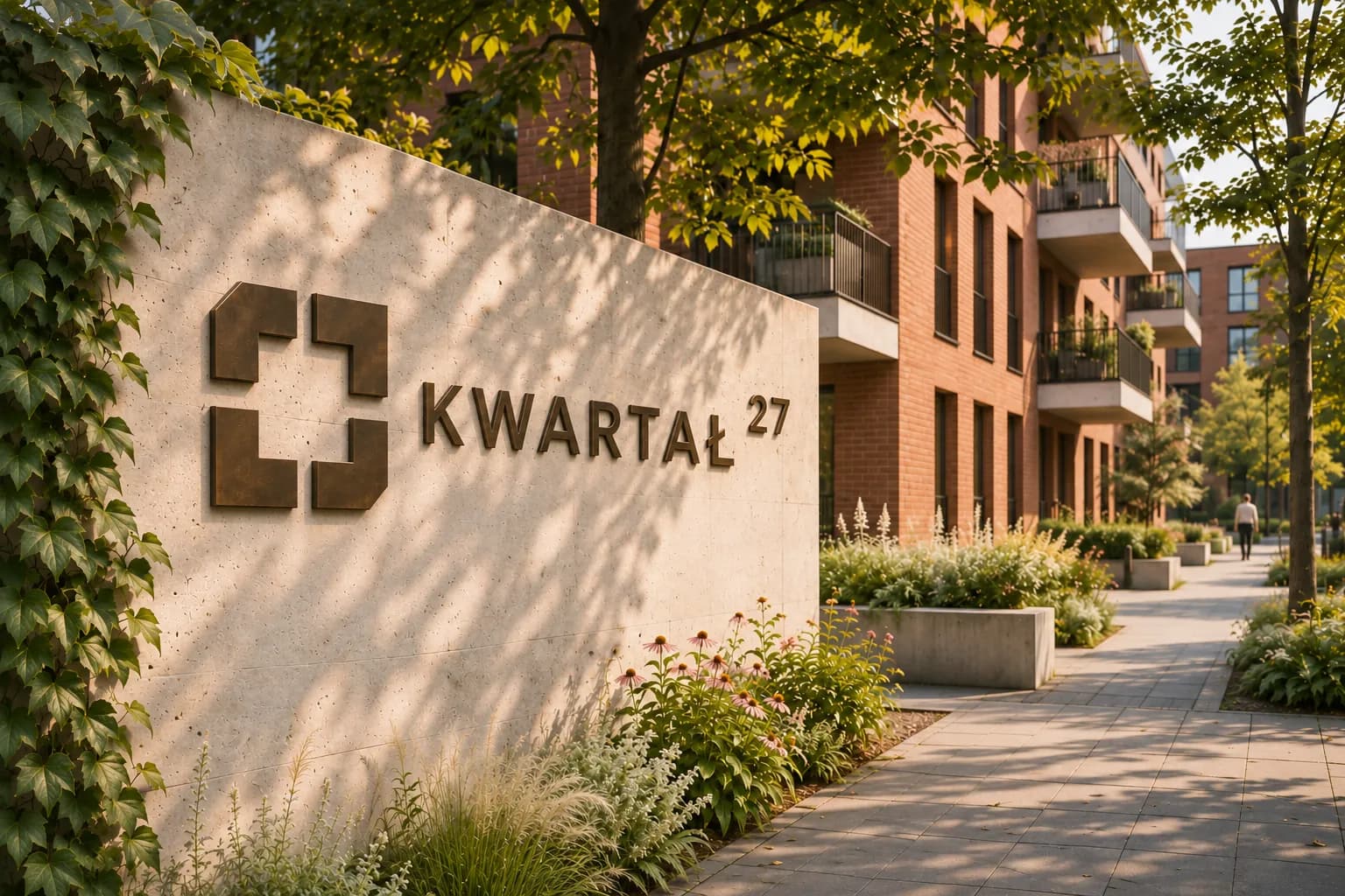
- a dimensional logo on the wall marks the entrance and shows at once where KWARTAŁ 27 begins,
- a courtyard plan board with building markers helps residents and visitors find their way around the grounds,
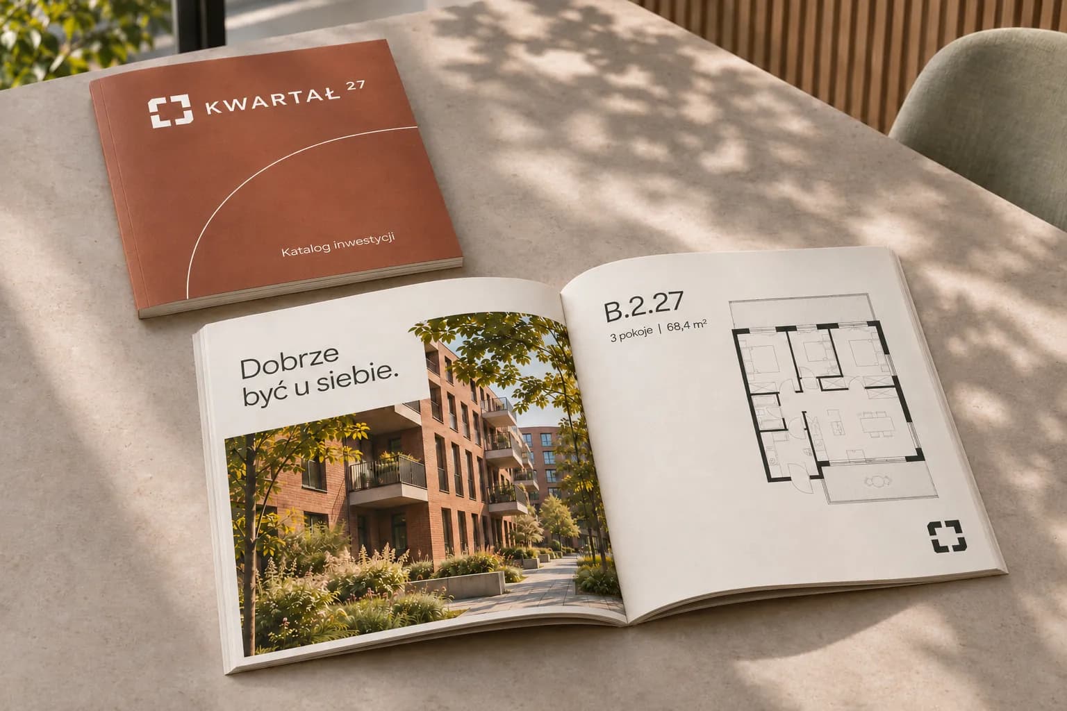
- the investment catalogue combines architecture photos, flat plans and a subtle arch motif that runs through the cover and spreads,
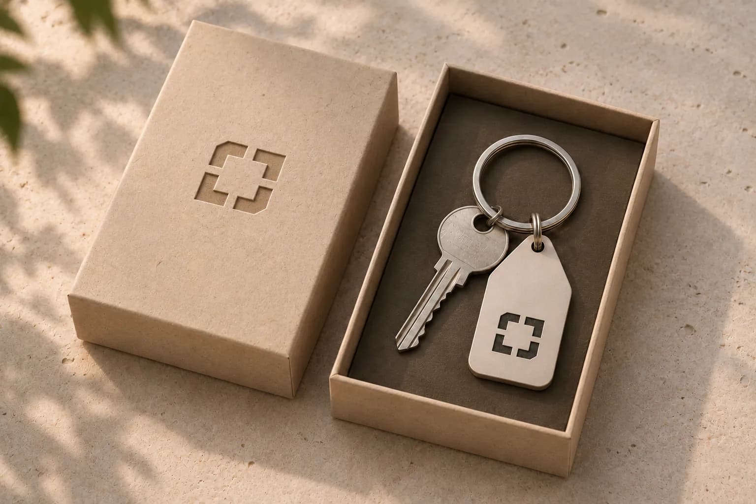
- the set ends with a box with an embossed symbol and a matching metal key fob: pieces that come with the key handover and stay with the resident for years.
We also made a logo animation in which the symbol assembles from four corners on a construction grid, with the line "Miasto w twoim rytmie" appearing under the name.
Results
4
applications: entrance, courtyard plan, catalogue, keys
4
corners that form the symbol
3
materials in the palette: brick, light surfaces, metal
Gallery
Want results like these?
Tell us about your company. In 30 minutes we'll find the best place to start.
Book a free meeting →