AERØ
AERØ visual identity: electric transport from the airport to the city
A brand for autonomous, electric rides from the airport to the city centre: logo, colour system and wayfinding, from the vehicle to the app.
- Client
- AERØ
- Industry
- Transport / urban mobility
- Year
- 2026
- Scope
- Branding & Social Media
Challenge
AERØ — Move Beyond is a brand of autonomous, electric transport linking airports with the centres of European cities. A passenger who has just landed is tired, often in a foreign country, and has a few seconds to work out where to go and what to take.
So the identity had to do three things at once: make the service feel simple, build trust in vehicles that run without a driver, and help people find their way in an airport where the brand competes with dozens of other signs, screens and messages.
Solution
The visual system draws on Scandinavian minimalism and architecture:
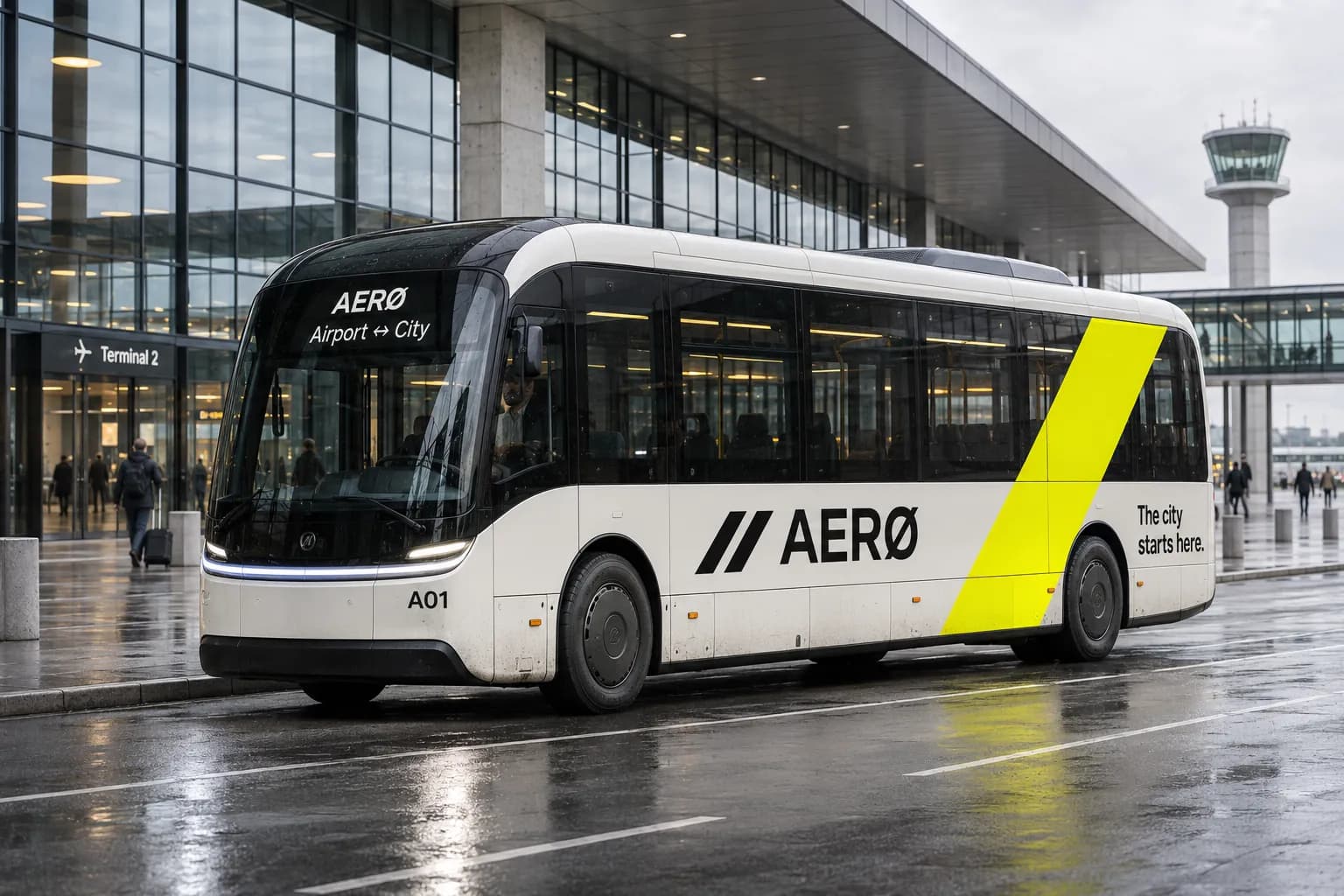
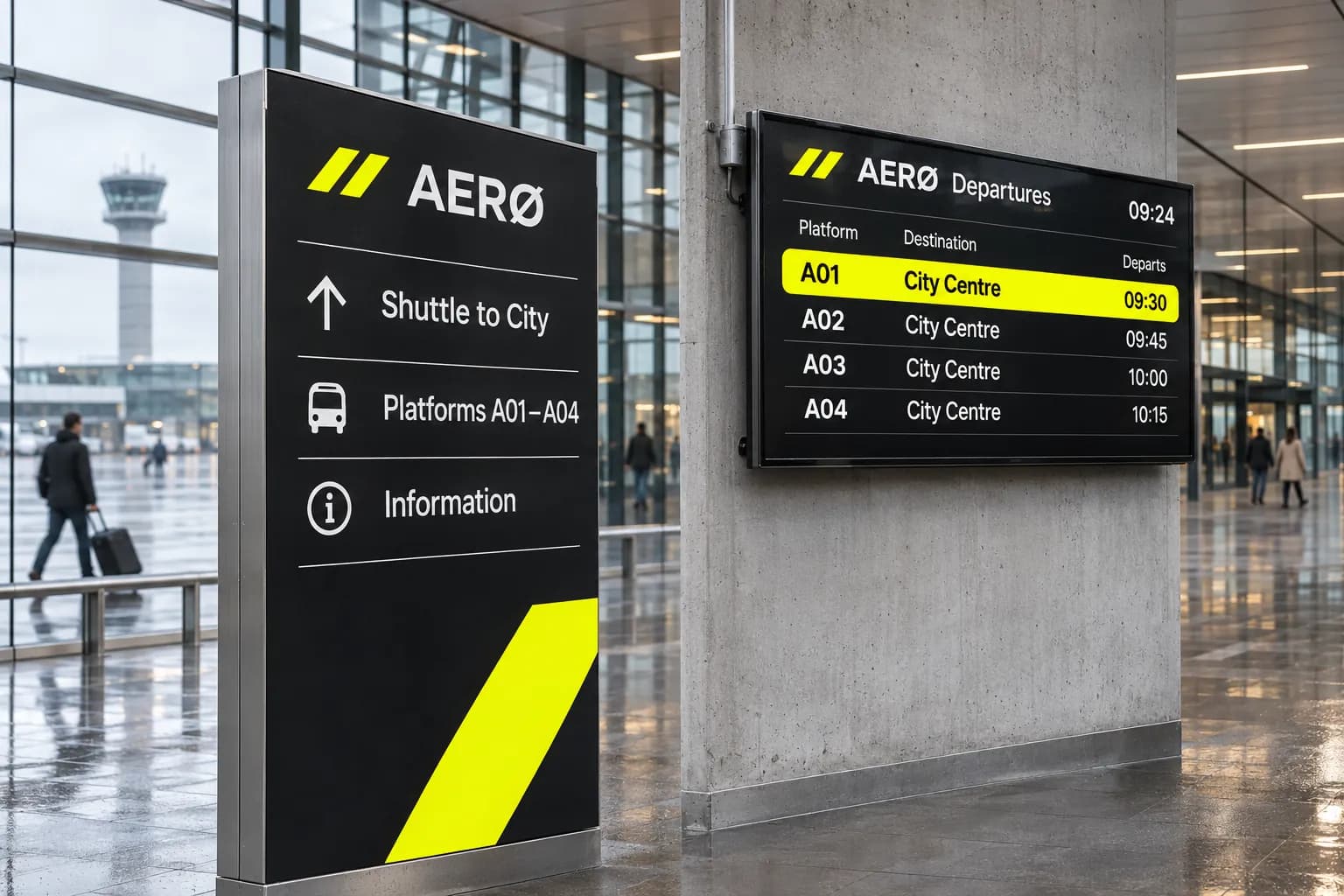
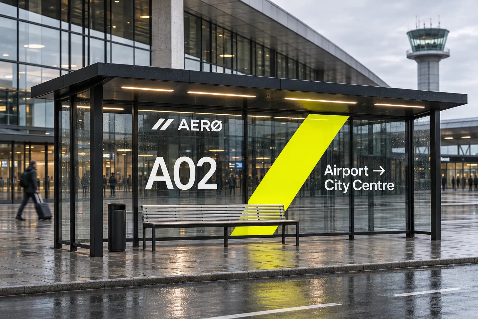
- a mark made of two diagonal stripes stands for movement and direction; the same stripes guide the eye on vehicles, stops and boards,
- the letter "Ø" in the name points to the brand's Danish origins and sets it apart from other operators at a glance,
- black and off-white form a calm, legible base, while neon yellow is reserved for the most important information: direction, platform number and the next departure,
- the line "The city starts here." presents the airport ride as the start of the city experience, not just the way to get there.
We extended the identity to every passenger touchpoint: vehicles, stops, wayfinding and departure boards, advertising and app mock-ups. We also made a logo animation in which the mark builds itself from the lines of its construction grid, ready for the app, terminal screens and social media.
Results
5
touchpoints: vehicles, stops, wayfinding, advertising, app
3
colours in the brand system
2
diagonal stripes in the mark: movement and direction
Gallery
Want results like these?
Tell us about your company. In 30 minutes we'll find the best place to start.
Book a free meeting →